Smart Traveler
Native iOS transit app for SFMTA riders. Nearby stops, trip planning and step-by-step guided navigation, plus a 2026 redesign concept.
Intro
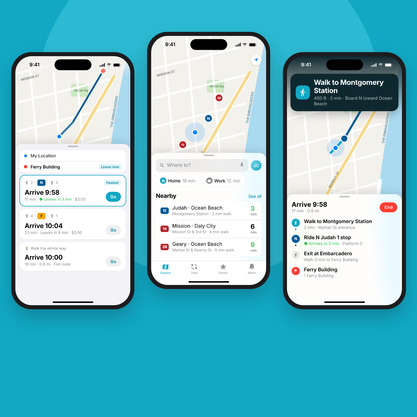
Transit riders juggle schedules, agency websites and map apps just to find out when the next bus comes. At Conduent, I was the lead designer on Smart Traveler, a native iOS app for the San Francisco Municipal Transportation Agency (SFMTA) that puts nearby stops, departures, trip planning and guided navigation in one place. I designed 52 screens in Adobe XD and worked with on-site engineers and an offshore team through the build, while also leading the web-based fleet transit system behind it. For this case study I also redesigned the key screens the way I would build them today.
Duration: 10 months (Aug 2018 to May 2019)
Role: Lead Designer, UX/UI Engineer
The Problem
Riders had no single place to see nearby stops, check departures and plan a trip. Information lived in separate tools, and none of them walked a rider through the trip itself, from the walk to the stop to the right place to get off.
The Goal
Design a native iOS app that gets a rider from "where am I?" to "you have arrived" with as little typing and guessing as possible, using the patterns iPhone users already know.
My Role
Research & Competitive Review Reviewed SFMTA rider surveys and feedback, and compared Transit, Google Maps and Apple Maps.
Mobile UX & Flows Mapped the rider journey from launch and location permission to search, trip planning and arrival.
Native iOS Design Designed around system patterns: the iOS keyboard, permission dialogs, push notifications and swipe gestures.
High-Fidelity Design Built 52 screens, a component library and a clickable prototype in Adobe XD.
Usability Testing Ran moderated walkthroughs with SFMTA employees and volunteers.
Build Support Worked with on-site engineers and the offshore team, reviewing builds against the designs.
User Research
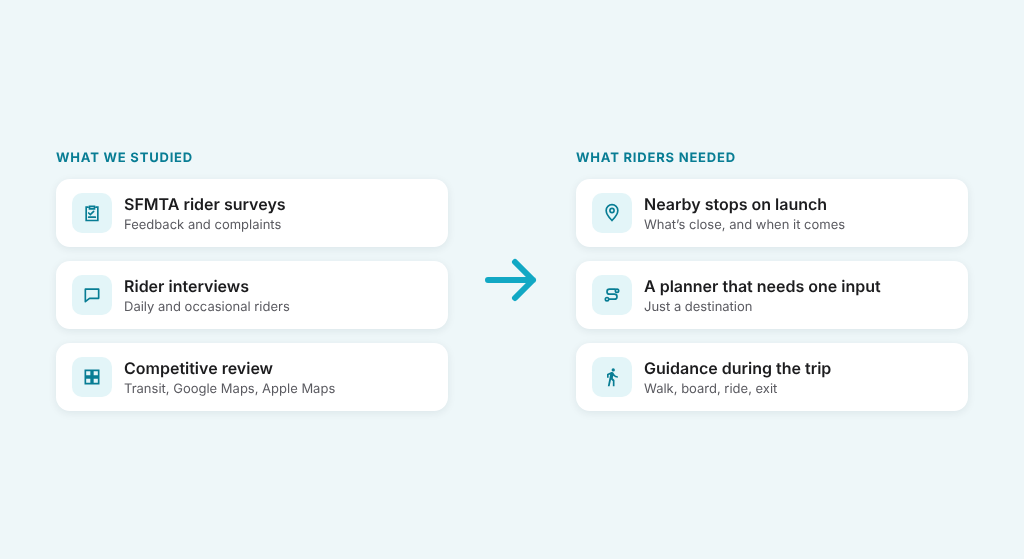
We started with what SFMTA already had: rider surveys, feedback and a handful of rider interviews. We then compared the apps riders were already using, mainly Transit, Google Maps and Apple Maps, to see what they expected from a native app. Three needs shaped the design: a Nearby Stops map that answers "what's close?" on launch, a Trip Planner that needs only a destination, and Guided Navigation that breaks a trip into walk, board, ride and exit steps. Saved Home and Work locations and service alerts cover the daily commute.
Key Pain Points & Solutions
Scattered Information
Stops, schedules and routes lived in different places. A map-first home screen shows nearby stops and departures together.
Too Much Typing
Entering addresses on a phone is slow. Saved Home, Work and Favorites, plus "Choose on map", cut most trips to a tap or two.
Lost Mid-Trip
Riders weren't sure when to board or get off. Guided Navigation walks through each step until arrival.
Surprise Delays
Riders found out about disruptions at the stop. Push notifications and service alerts reach them before they leave.
User Personas

Andre
Occasional Rider
Andre takes transit a few times a month and doesn't know the routes. He needs to type a destination, see clear options and be told exactly when to walk, board and get off. Guided Navigation is built for him.

Rosa
Visitor
Rosa is in San Francisco for a few days and plans trips on the spot. She browses the map more than she searches, so the Nearby Stops view and "Choose on map" let her plan without knowing street names.

Maya
Daily Commuter
Maya rides the same route to work every weekday. She wants departures for her usual stop the moment she opens the app, and a heads-up when her bus is delayed. Saved Home and Work locations and scheduled notifications fit her routine.
Information Architecture
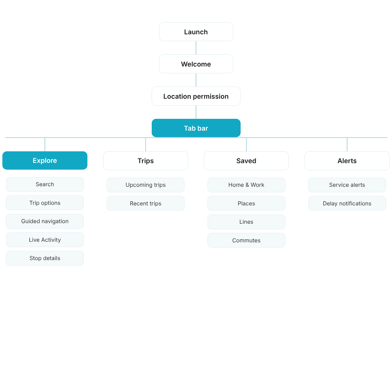
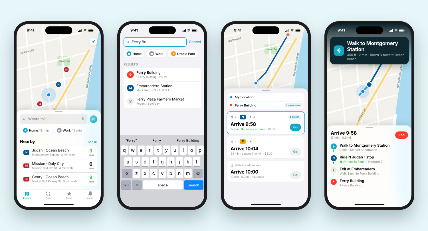
The app opens on the Nearby Stops map, the hub for everything else. From there a rider can search for a destination, open the Trip Planner, or tap a stop to see its departure schedule. A selected trip leads into Guided Navigation. The menu holds Favorites, Notifications, Service Alerts, Feedback and Account. Keeping the map as home means the most common question, "what's near me?", takes zero taps. The 2026 redesign moves these into a four-tab bar: Explore, Trips, Saved and Alerts.
Explore
The map-first home: nearby stops, live departures, search and stop details, leading into trip options and guided navigation.
Trips
Upcoming and recent trips, so a regular ride can be restarted in one tap.
Saved
Home, Work, favorite places and lines, with commute and delay alerts set by switch.
Alerts
Service alerts and delay notifications for the lines a rider follows.
Wireframes
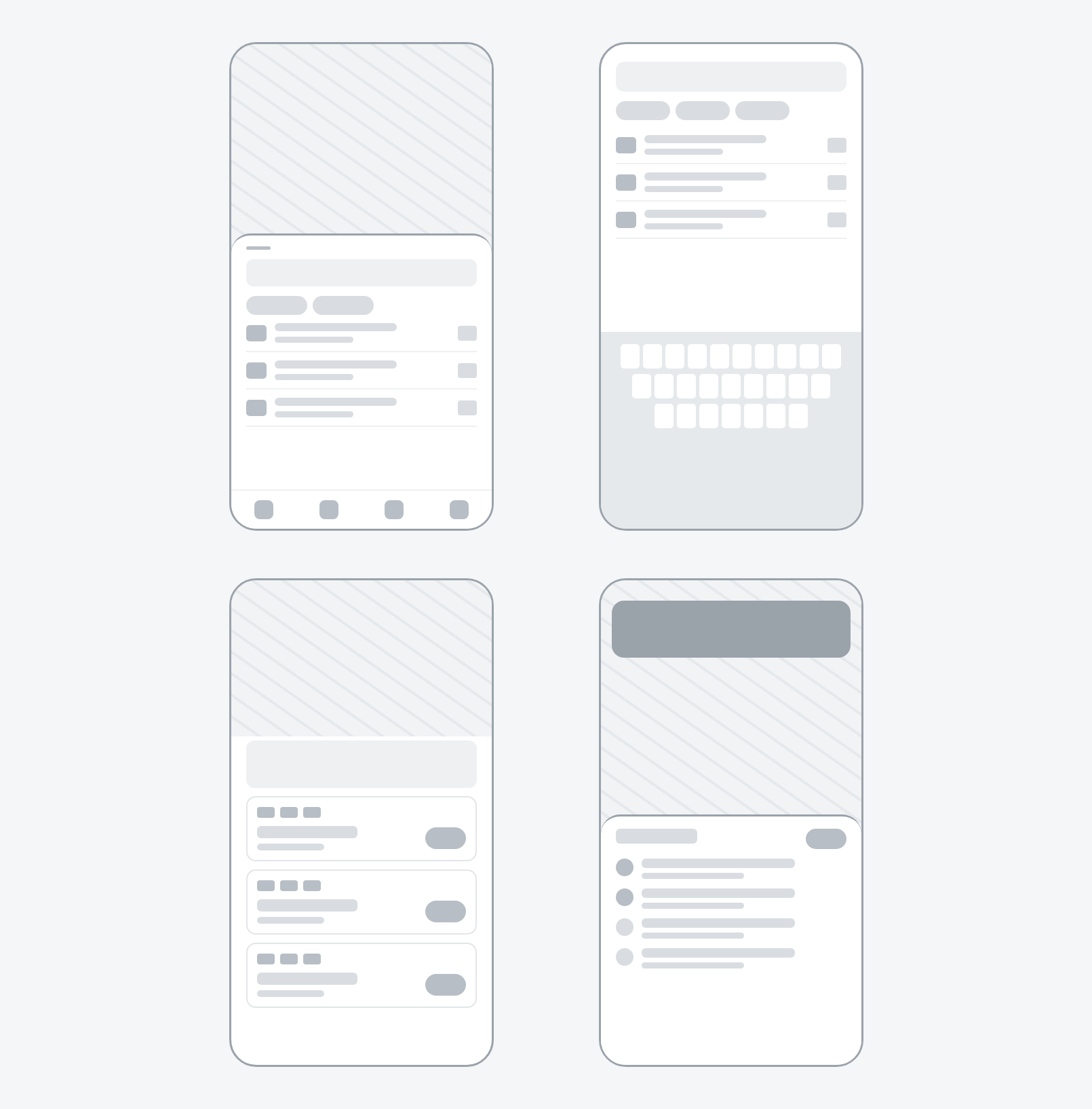
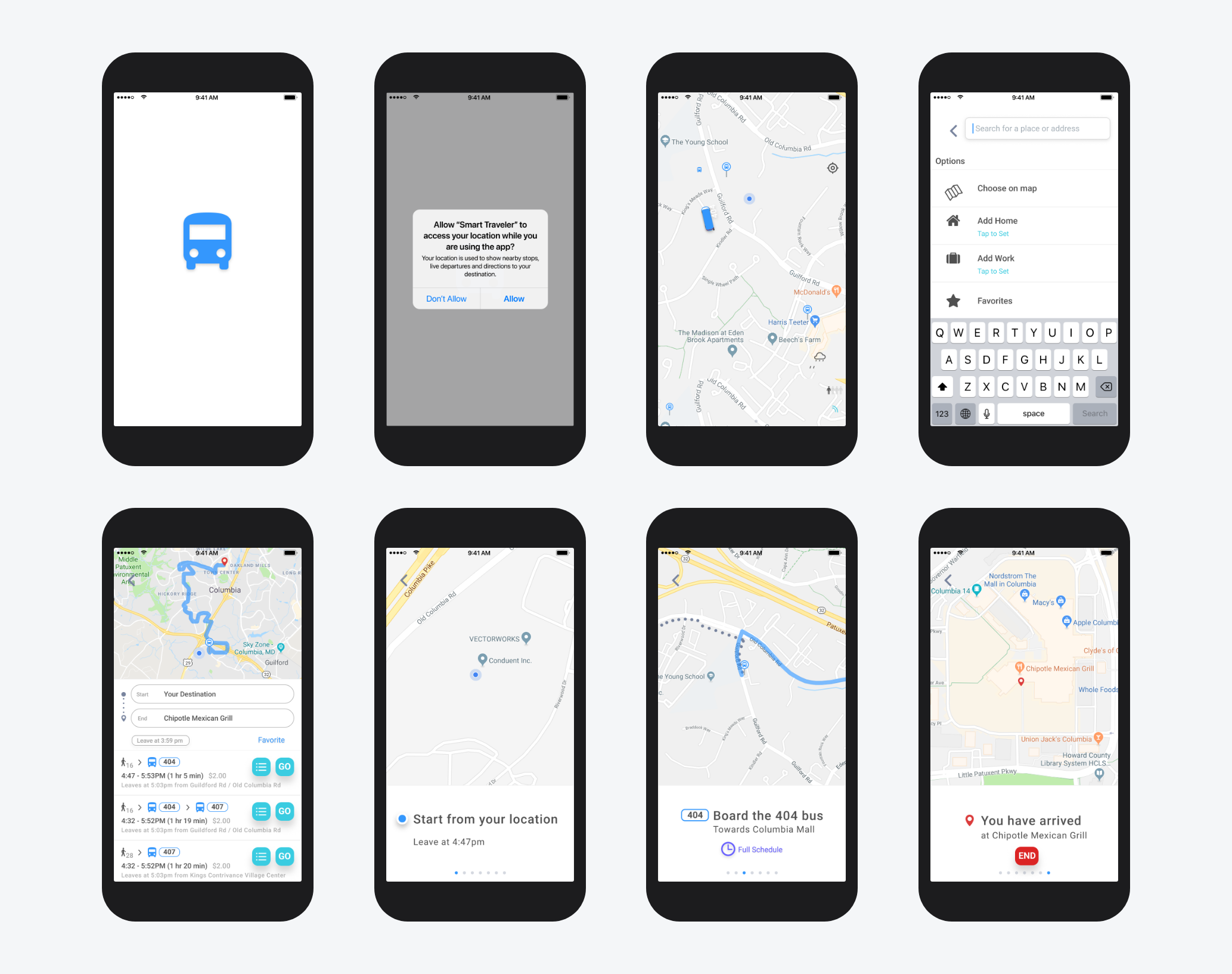
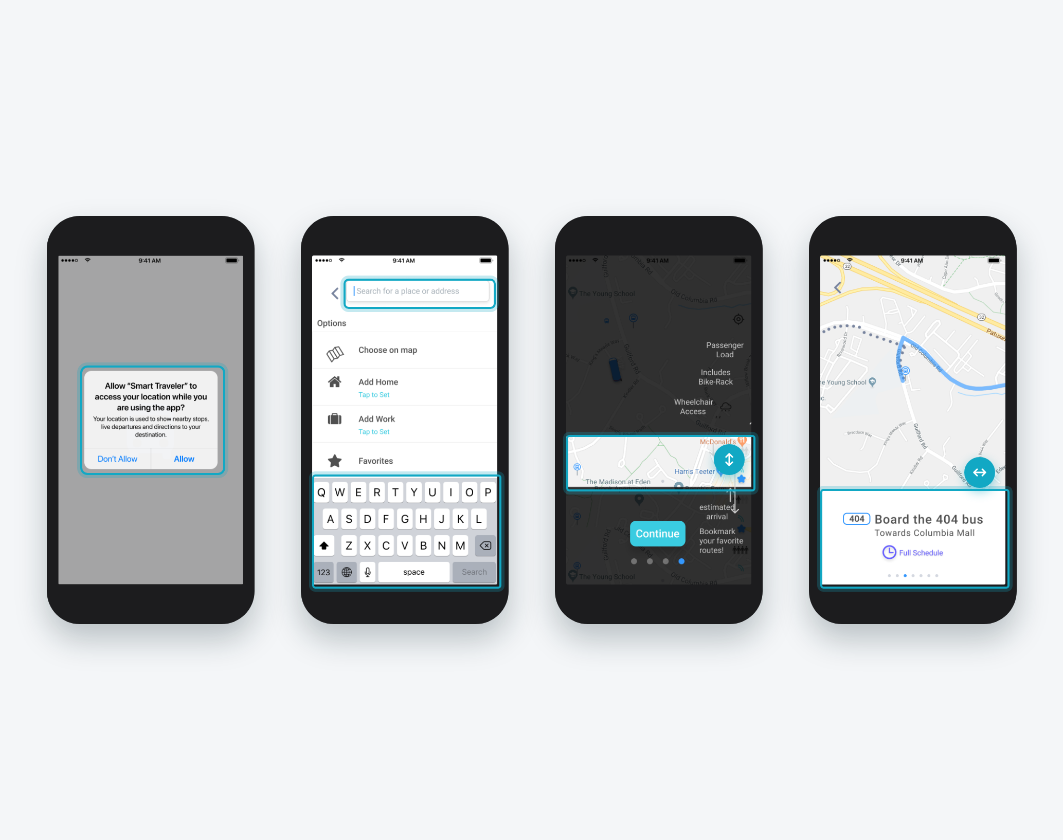
The original designs were built in Adobe XD at iPhone 8 size. I designed the map in three states (full map, split view and full list) so riders could swipe a panel up for more detail without leaving the map. Every text field was designed with the iOS keyboard in place, so nothing important sat underneath it. Native patterns carried the experience: system permission dialogs, the iOS keyboard, push notifications and swipe gestures.
Low-Fidelity Wireframes
Mid-Fidelity System Views
Usability Study
Moderated 30-minute app walkthroughs with a small group of SFMTA employees and volunteers. SFMTA staff hear rider complaints first, so they knew where riders get stuck.
Moderated Study
30-Minute App Walkthroughs
SFMTA Employees & Volunteers
Key Findings
- 1
Hidden Panel Participants didn't realize the stops panel could be swiped up. First launch got coach marks that point it out.
- 2
Slow Address Entry Typing a destination took too long. Home, Work and Favorites moved above the keyboard as one-tap shortcuts.
- 3
Trip Overview During guided navigation, participants wanted to see the whole trip. The step view now expands into a full list.
High-Fidelity Mockups
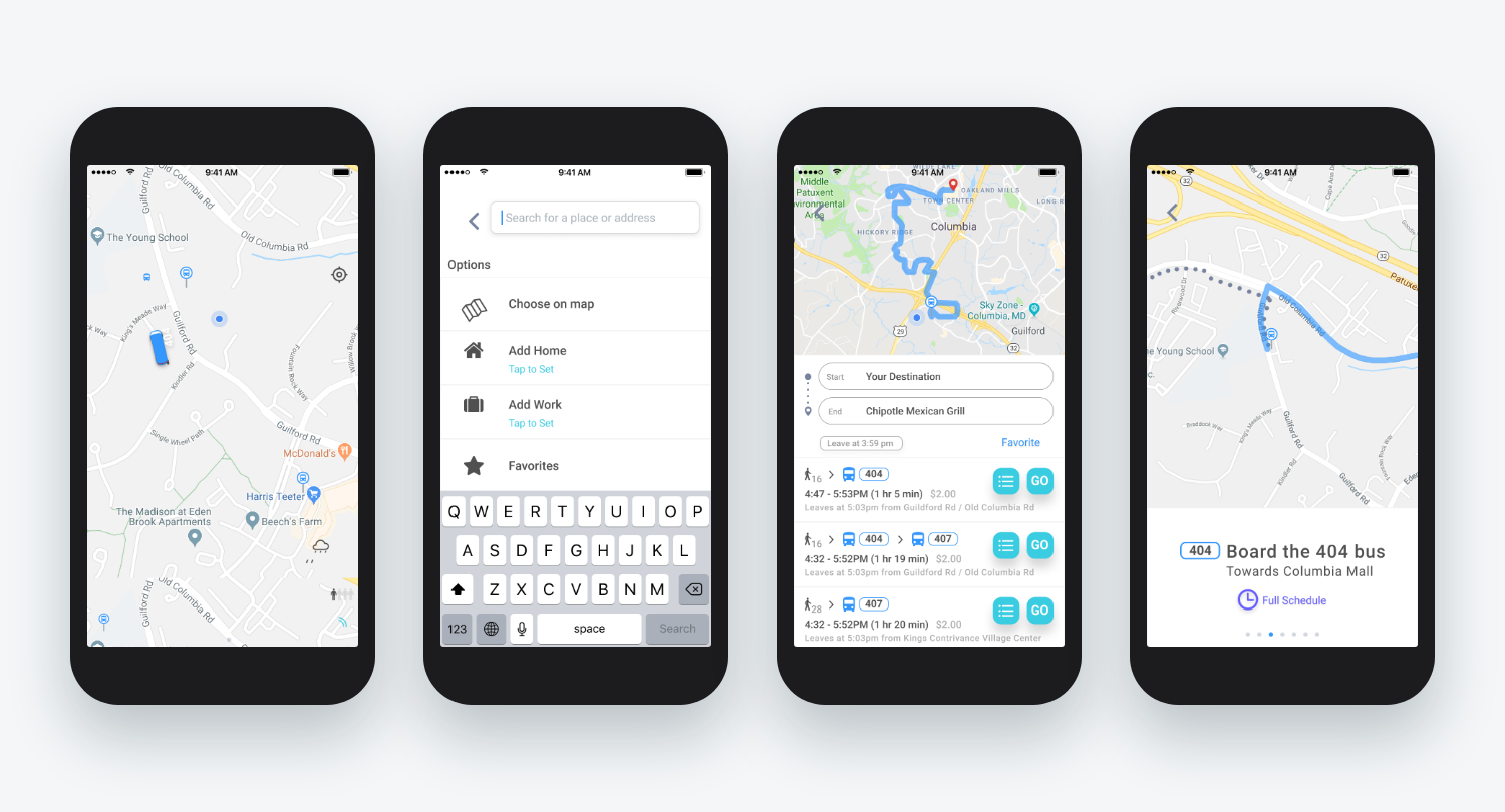
The 2018 design went to build with a map-first home, swipe-up panels for stops and trip options, and a seven-step guided navigation flow. For this case study I rebuilt the same flows with modern iOS patterns. The redesign is a concept, not a shipped product.
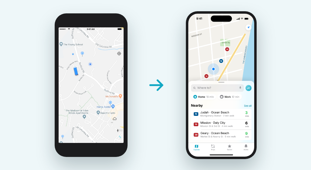
Before User Testing
2018 original: a map-first home, a hamburger menu for settings, swipe-up panels for stops and trip options, and a seven-step guided navigation flow handed off to the offshore team.
After User Testing
2026 redesign concept: a tab bar in place of the hamburger menu, resizable bottom sheets, a larger touch-first search with saved places above the keyboard, Live Activities for trips in progress, service alerts shown in place, and dark-teal guidance cards.
Accessibility Considerations
Designed with the system instead of around it: standard iOS controls, dialogs and keyboard so VoiceOver and system settings work as expected. The redesign adds Dynamic Type support, 44pt minimum touch targets and color contrast checked against WCAG AA, with route colors always paired with a label.
Standard iOS controls, dialogs and keyboard for VoiceOver support
Dynamic Type and 44pt minimum touch targets
WCAG AA contrast, with route colors always paired with a label
Impact
52
Screens designed in Adobe XD
25
Screens built by the offshore team
7
Steps in the guided navigation flow
Key Takeaways
Designing native taught me that the platform does half the work if you let it. Using the real keyboard, system permission dialogs and familiar gestures made the app feel at home on iPhone and gave engineers fewer custom pieces to build. Working with an offshore team taught me to document states and edge cases up front, since a missing state becomes a guess in the build. Those habits carry into my mobile web work, where the keyboard, touch targets and swipe still apply.
What I'd do differently today: replace the hamburger menu with a tab bar so key areas are one tap away, teach features in context instead of with first-launch coach marks, and design for every screen size with Dynamic Type instead of one fixed iPhone layout.
Next Steps
Live Trip Tracking
Add Live Activities and Lock Screen updates so riders can follow a trip without opening the app.
Fare Payment
Bring mobile ticketing and Apple Pay into the trip flow so planning and paying happen in one place.
Rider Testing
Test the redesign concept with riders to check the tab bar and bottom sheet changes against real trips.
Final Product
Clickable prototype of the 2026 redesign concept, built in Figma Make. Walk the full flow from launch to arrival: search for a destination, compare trip options, follow guided navigation, and check Trips, Saved and Alerts.