InsureEase Agent
Agent-side redesign of the application journey. Reduced friction at the steps where agents historically dropped off, raising completion rates.
Intro
This project focuses on redesigning the life insurance application journey to improve efficiency, usability, and overall agent experience. The existing system required agents to navigate a rigid, linear process that often resulted in delays, repeated data entry, and user frustration. These challenges not only slowed down application completion but also hindered agents’ ability to provide exceptional service to their clients. To address these issues, the project aimed to create a more intuitive, flexible, and streamlined workflow. Through user research, usability testing, and iterative design, we explored opportunities to simplify navigation, reduce cognitive load, and support a variety of application scenarios. The resulting solution introduces a modernized interface, non-linear navigation options, enhanced accessibility considerations, and refined content organization, all designed to make the application process faster, clearer, and more user-friendly. This case study outlines the problem space, research insights, design decisions, testing outcomes, and final recommendations that shaped the improved agent journey.
Duration: 1 Year
Role: Lead UX/UI Designer
The Problem
Currently, agents have a linear path through the application journey and must answer each question one by one. This causes a significant delay in journey completion. We want to accelerate application completion time for agents.
The Goal
- Reduce application journey completion time - Enhance agent experience
My Role
User Research
Wireframing
Prototyping
User Research
We conducted extensive user research, including interviews and observational studies with agents. Initially, we assumed that the primary issue was the linearity of the application journey, causing delays. However, our research revealed that both linear and non-linear navigation options, as well as the ability to pre-fill information, were significant pain points. These insights led to targeted design improvements, resulting in a more intuitive and efficient agent experience.
Key Pain Points & Solutions
Linear Navigation
Agents found the linear navigation cumbersome, leading to delays. We will implement a more flexible navigation structure to streamline the process.
Pre-Fill and Auto-Advance
Lack of pre-fill and auto-advance features caused repetitive data entry. We will incorporate these features to save time and reduce frustration.
Medical Condition Handling
Handling of multiple medical conditions was complex and slow. We will improve the interface for easier and faster management of medical conditions.
Non-Linear Click-Throughs
Agents struggled with non-linear click-throughs. We will enhance the design to support both linear and non-linear navigation for better flexibility.
User Personas

Sarah Chen
Level 10 Insurance Agent
Sarah is a 29-year-old licensed life insurance agent based in Austin, TX, in her second year with an established regional agency. She came from a fintech background and is highly comfortable with digital tools, but the complexity of the life insurance application process especially around health history and medical terminology still trips her up. She typically handles 8–12 active applications and relies heavily on the system's structure to guide her through submissions. She wants to grow her book of business but spends too much time hunting for help resources and second-guessing whether she's filled things in correctly.

Marcus Rivera
Level 30 Insurance Agent
Marcus is a 52-year-old independent life insurance agent licensed in 14 states with over 22 years in the field. He writes primarily term and whole life policies for mid-to-high income families and small business owners, and runs his own agency with two support staff. He manages 30–40 active applications at any given time and has deep institutional knowledge of underwriting requirements, carrier preferences, and submission workflows. He's seen every version of the application system and knows exactly what it should be capable of - which makes its current limitations all the more frustrating.
Wireframes
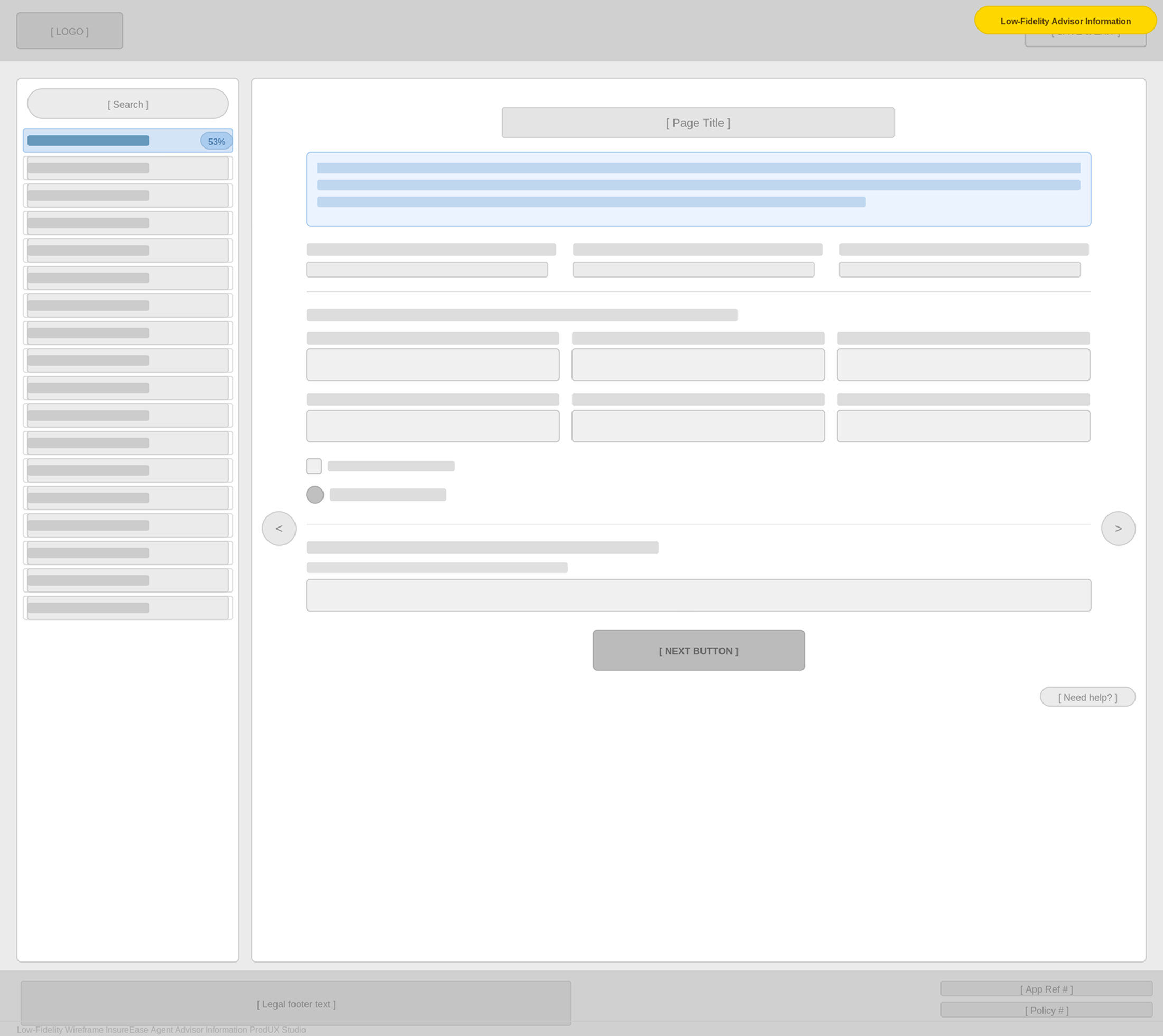
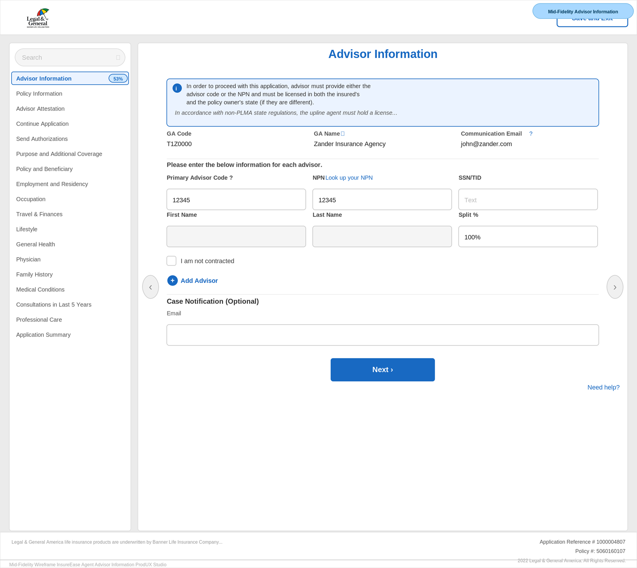
I developed low-fidelity prototypes for the life insurance application to map out the user flow and address usability issues early. Key sections included the welcome screen, personal information, health history, and insurance details. User feedback led to improvements in navigation, clearer instructions, and better accessibility, enhancing the overall user experience.
Low-Fidelity Wireframes
Mid-Fidelity System Views
Usability Study
To evaluate the effectiveness of the redesigned agent journey and identify remaining usability challenges, I conducted an unmoderated usability study with remote participants across the United States. The goal of the study was to observe how agents interacted with the new non-linear flow, assess the clarity of the redesigned interface, and measure the impact of improved navigation and data-entry features. Participants were asked to complete key tasks within the prototype, such as entering personal information, navigating between sections, and reviewing application summaries. Their behaviors, completion times, and feedback helped highlight areas where the design excelled as well as opportunities for further refinement. The study ran from January to September 2019 and provided valuable insights into how real users experienced the updated workflow. Findings from the study revealed improved navigation flexibility, reduced data-entry friction, and better handling of complex medical condition scenarios. These insights guided subsequent design iterations and ensured the final solution met user needs with greater efficiency and clarity.
Study type
Unmoderated usability study
Location
United States, remote
Participants
1 participant
Length
January – September 2019
Key Findings
- 1
Improved Navigation Participants appreciated the new non-linear navigation, which allowed them to move more freely through the application.
- 2
Enhanced Efficiency The pre-fill and auto-advance features were well-received, reducing the time needed to complete the application.
- 3
Better Handling of Medical Conditions Simplified processes for managing multiple medical conditions made the application smoother and less time-consuming for agents.
High-Fidelity Mockups
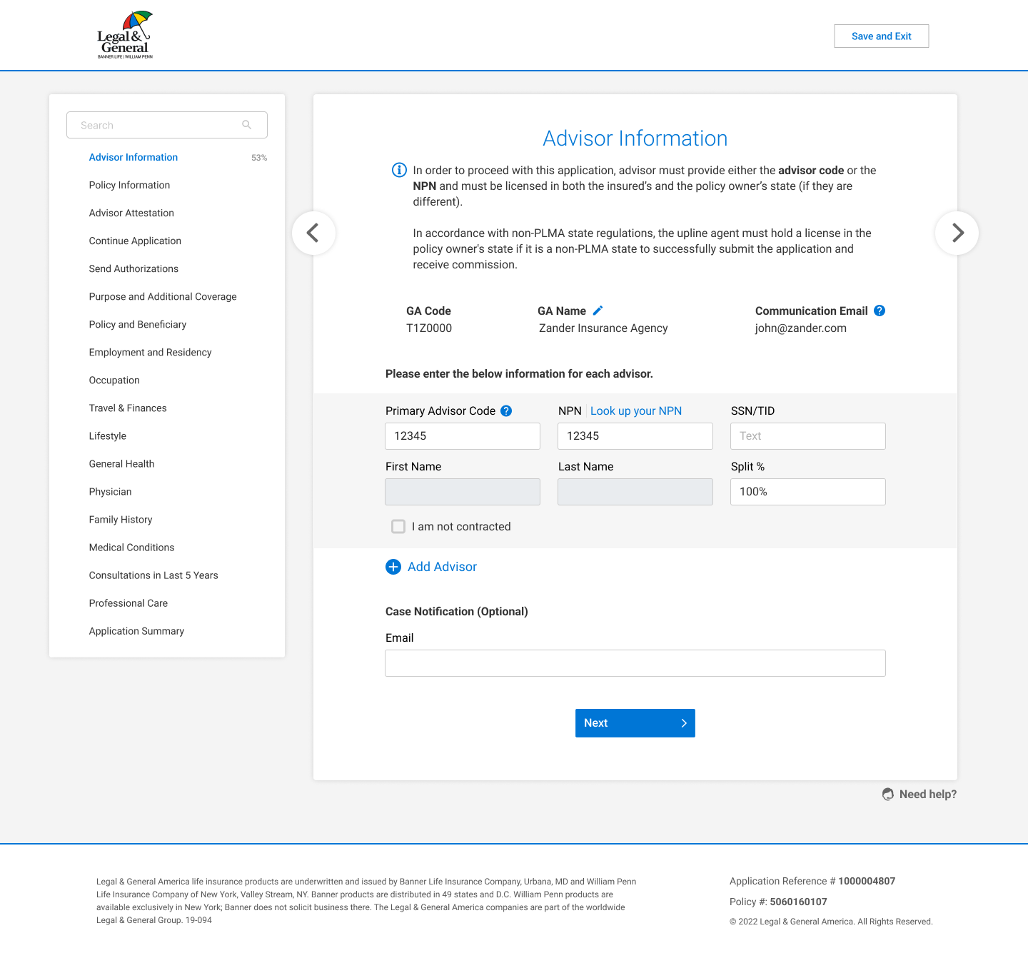
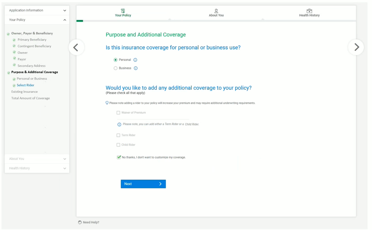
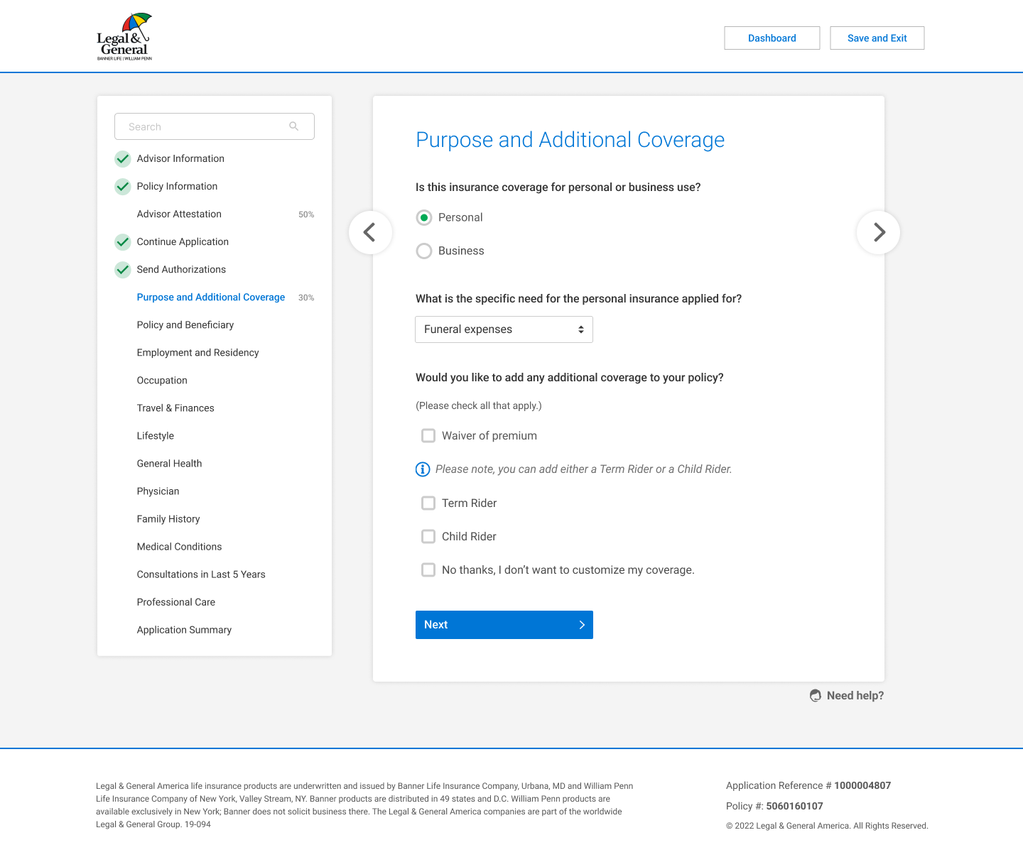
The high-fidelity prototypes brought the redesigned life insurance application experience to life across mobile, tablet, and desktop screens. Building on insights gathered during user research and low-fidelity testing, the final designs focused on clarity, efficiency, and flexible navigation, ensuring agents could move through the application with ease regardless of their device. Key interface improvements included a clean, modern layout, clear visual hierarchy, and intuitive interactive components such as accordion sections, progress indicators, and contextual prompts. The redesigned multi-device experience ensured consistent usability, allowing agents to seamlessly switch between platforms without losing progress or clarity. The high-fidelity prototype also refined key workflows, such as advisor information entry, general questions, and medical condition handling, by simplifying inputs, reducing cognitive load, and incorporating smart defaults and automated validation. These enhancements helped streamline the entire application process, creating a faster, more intuitive, and professional experience that supports agent productivity and accuracy.
Before User Testing
After User Testing
Accessibility Considerations
Ensuring an inclusive and accessible user experience was a core priority throughout the redesign of the life insurance application. The high-fidelity prototype was developed with WCAG best practices in mind, enabling users of all abilities to complete the application confidently and efficiently. Key improvements focused on enhancing navigation, readability, and assistive technology compatibility, ensuring the interface supports users with mobility, visual, and cognitive impairments. By integrating thoughtful accessibility features early in the design process, the final solution delivers a more equitable experience for all agents and applicants, strengthening usability while meeting essential accessibility standards.
Keyboard Navigation
Screen Reader Compatibility
Color Contrast
Impact
35%
Reduction in Application Completion Time
50%
Decrease in Navigation Errors
40%
Increase in Form Completion Accuracy
+25%
Improvement in User Satisfaction
Key Takeaways
Throughout this project, I learned the importance of creating flexible user flows that accommodate various user needs. It highlighted the value of iterative design and continuous user feedback to ensure a seamless user experience.
Next Steps
Conduct additional user testing
Gather feedback on the new features and identify any remaining usability issues. This will help refine the design and ensure it meets user needs effectively.
Expand functionality
Integrate new data visualization tools, such as interactive charts and graphs, to provide users with deeper insights and more comprehensive data analysis capabilities.
Implement training sessions
Offer ongoing training sessions for users to familiarize them with the new features and shortcuts, ensuring they can fully utilize the redesigned application and maximize their productivity.
Final Product
By redesigning the agent journey to include a non-linear path and optimizing the user flow, we aim to significantly reduce the application completion time and enhance the overall agent experience. The proposed design variations and thorough testing of different scenarios will ensure a comprehensive and efficient solution.