BenefitLens
A responsive self-service portal that lets insurance members read their dental plan the way they actually think about it.
Intro
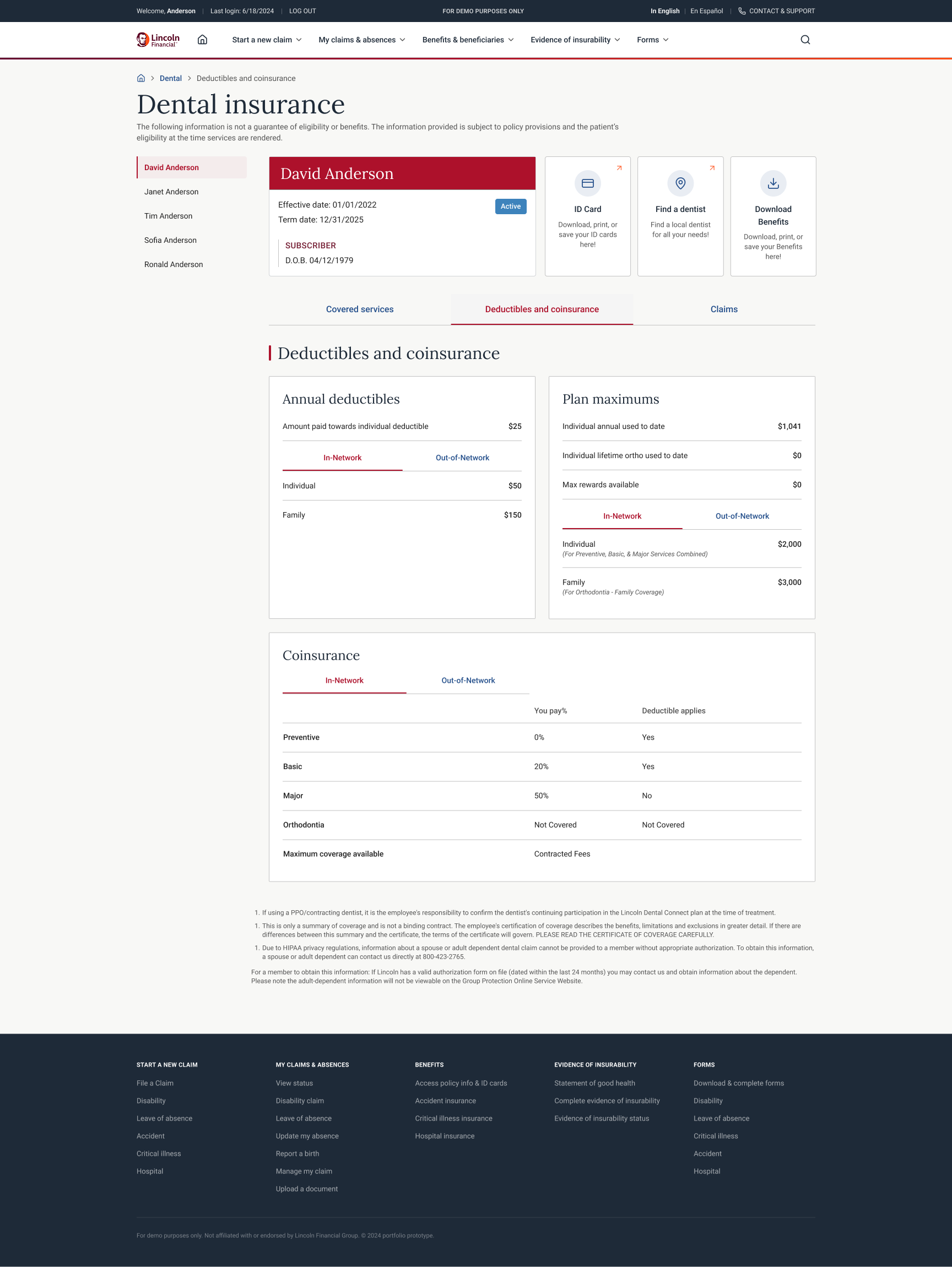
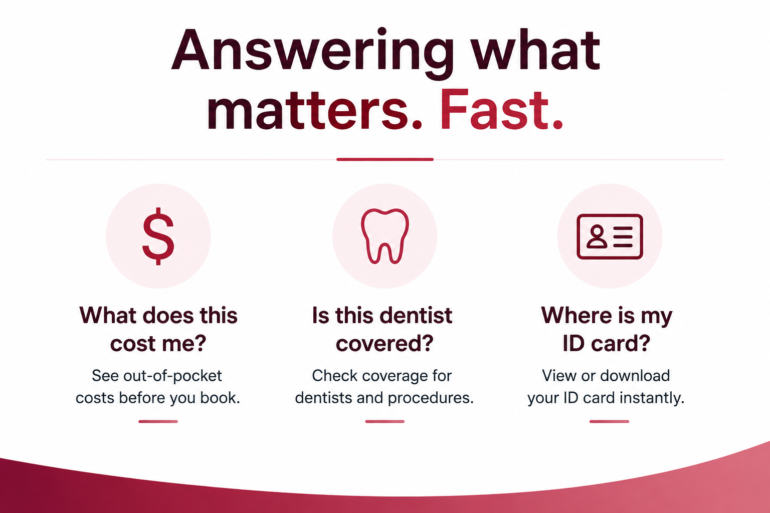
Insurance members rarely open a benefits portal to browse. They open it with a specific question: what does this cost me, is this dentist covered, where is my ID card. This project reshaped a group dental plan into a member portal that answers those questions in one or two steps, works from a 320px phone up to a full desktop, and reads clearly enough to be handed straight to usability testing.
Duration: 12 weeks, 2024
Role: Lead Product Designer
The Problem
Dental coverage is dense. A single plan carries deductibles, annual and lifetime maximums, in-network and out-of-network rates, and separate coinsurance for preventive, basic, major, and orthodontic care. Members were expected to absorb all of that from static documents, then still call support to answer basic questions like "is my dependent covered" or "what will a filling cost me." The core problem: the plan data existed, but it was not organized around the questions a member actually asks, and it was not usable on the device most members reach for first.
The Goal
Turn a group dental plan into a self-service portal where a member can, without help: • Switch between the subscriber and each dependent on the plan • See coverage status, effective dates, and their ID card at a glance • Understand deductibles, maximums, and coinsurance for in-network and out-of-network care • Find a participating dentist, file a claim, and reach the right forms • Do all of it on a phone as easily as on a desktop
My Role
Led end-to-end UX from research through high-fidelity design
Mapped plan data to member questions and defined the information architecture
Designed the responsive system across four breakpoints
Planned and ran moderated usability testing
Partnered with engineering on a component-based build
User Research
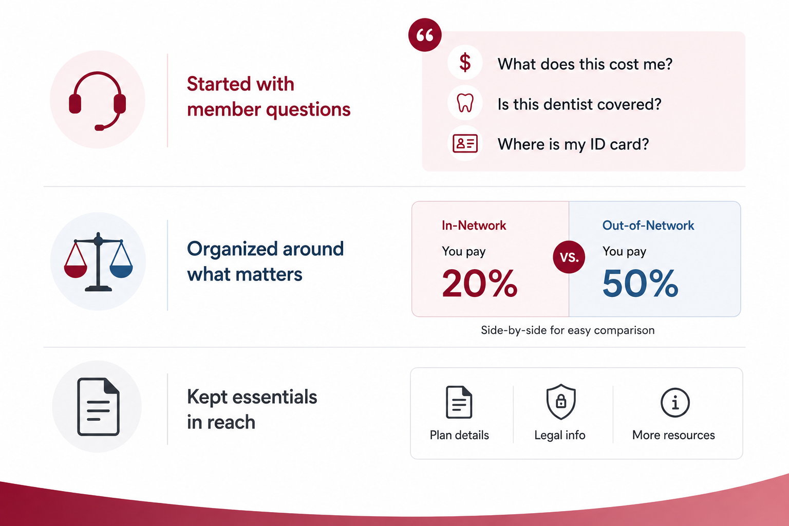
I started by reviewing recent member support calls to find the questions that kept pulling people off self-service, then grouped the plan's data around those questions instead of around the insurer's internal structure. Coverage that members compare side by side, such as in-network versus out-of-network coinsurance, was designed to sit side by side. Reference material that members rarely need, such as the HIPAA and certificate-of-coverage disclosures, was kept accessible but out of the primary path.
60
support calls reviewed
tagged for the themes that pointed to self-service gaps
6
members interviewed
across subscribers and dependents
5
top tasks
the jobs the portal had to nail
Key Pain Points & Solutions
Coverage was a guessing game
Members could not tell what a visit would cost them without calling, because deductibles, maximums, and coinsurance were never shown together.
Family plans were opaque
A subscriber managing coverage for a spouse and children had no clear way to switch between members and see each person's status.
The phone experience was an afterthought
The people most likely to check coverage on the go had the least usable layout.
Answers were buried in documents
ID cards, forms, and find-a-dentist links were scattered instead of surfaced where members look first.
User Personas

David
Plan subscriber managing coverage for himself and three dependents
Checks the portal a few times a year, usually before booking an appointment, often from his phone.

Maria
Member weighing a specific procedure
Wants to know the out-of-pocket cost for basic or major work before scheduling.
Information Architecture
The portal is organized around a member context, then the three things members do most. Everything sits under a selected member (subscriber or dependent), so the entire page reflects one person at a time. From there the structure splits into quick actions (ID card, find a dentist, benefits) and the three primary areas of the plan.
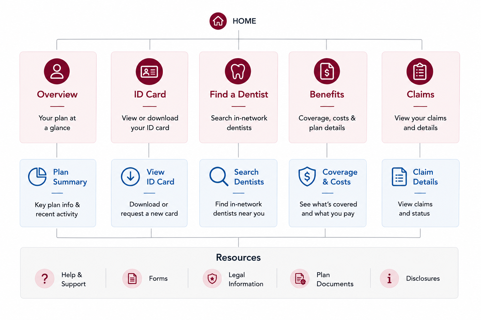
Member selector
A single control at the top sets who the page is about, so a subscriber can move between themselves and each dependent without losing their place.
Covered services
What the plan pays for, by category.
Deductibles and coinsurance
Annual and lifetime maximums, plus in-network and out-of-network rates for preventive, basic, major, and orthodontic care.
Claims
File and track claims, tied to the selected member.
Additional resources
Forms, Lincoln DentalConnect, and FAQs, kept one tap away without crowding the primary path.
Wireframes
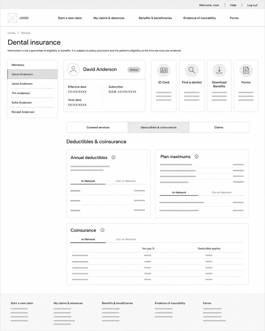
Early layouts established the member-first pattern: a persistent member selector, a coverage summary card, and a row of task tiles that stay reachable on small screens. I worked mobile first, so the 320px layout drove the hierarchy and the desktop layouts earned their extra columns rather than the reverse.
Low-Fidelity Wireframes
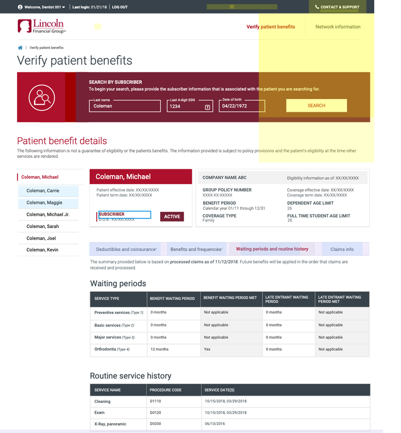
Mid-Fidelity System Views
Usability Study
I put the coverage-reading and member-switching tasks in front of members and watched where they hesitated. The deductibles and coinsurance screen was the main test target, since it carries the densest information in the plan.
Participants
8
Task completion
92%
Avg. time on key task
38 seconds
Format
Moderated, remote
Key Findings
- 1
Members found the in-network versus out-of-network split immediately once it became a labeled tab rather than a second column of numbers.
- 2
The member selector needed a stronger active state before people trusted which person they were viewing.
- 3
Coinsurance percentages were understood faster when paired with a plain "deductible applies" yes or no.
High-Fidelity Mockups
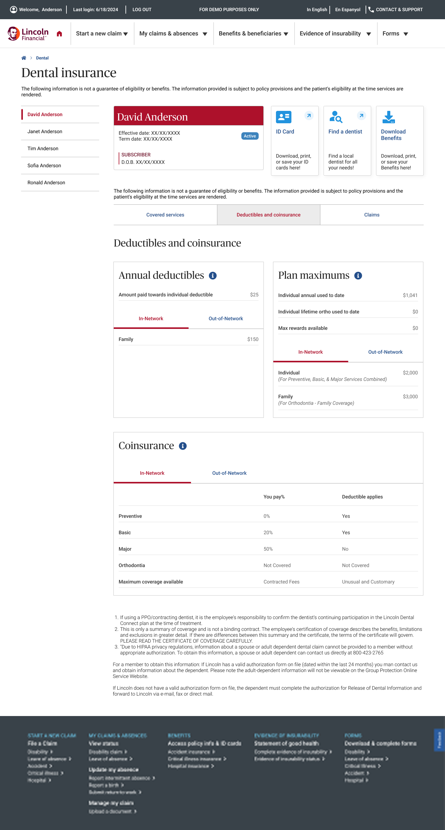
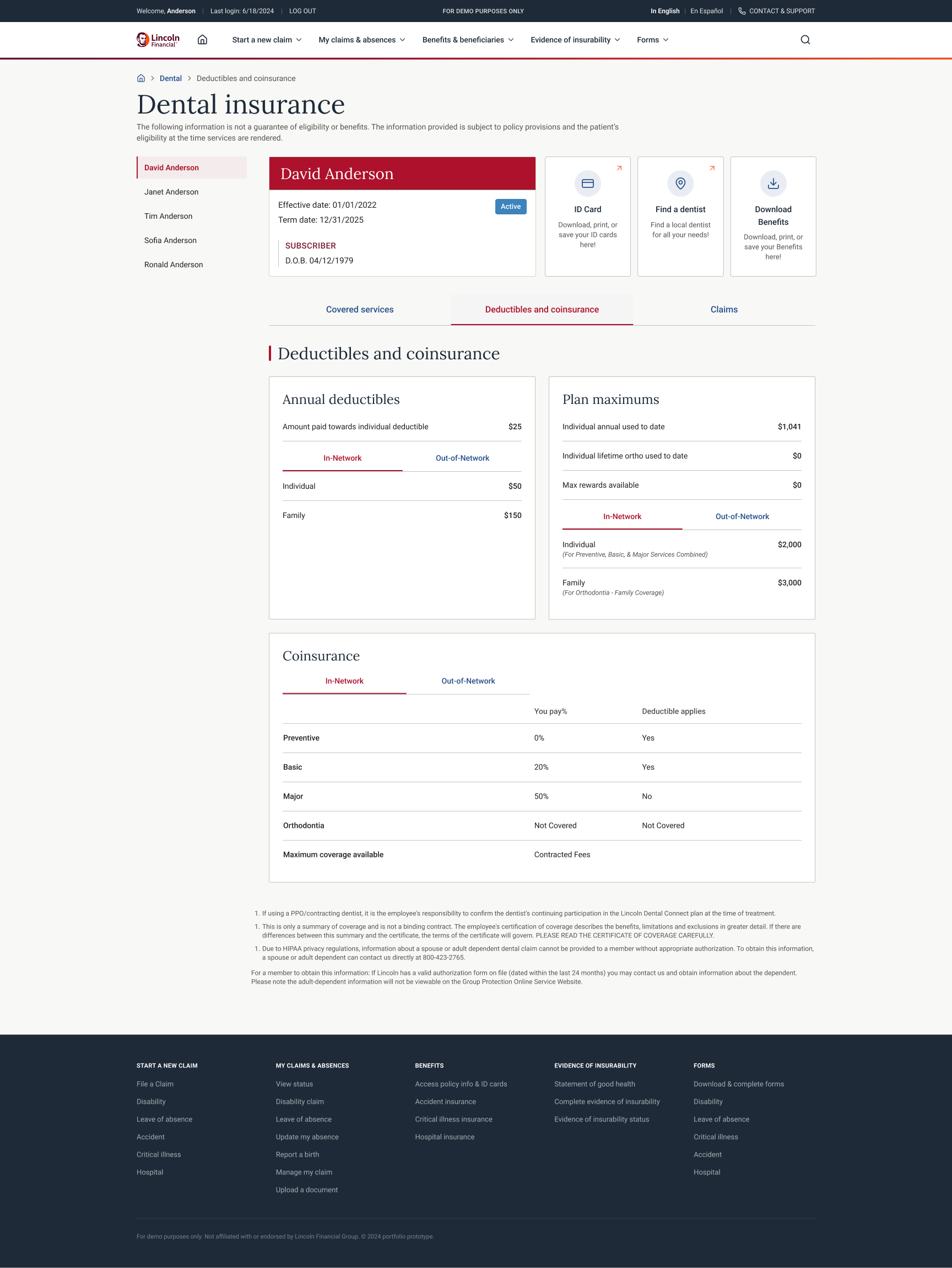
The final design uses Lincoln Financial's brand system: the red member card anchors identity, restrained typography keeps dense tables readable, and clear tabs separate in-network from out-of-network figures. The deductibles and coinsurance screen presents annual deductibles, plan maximums, and a coinsurance table for preventive, basic, major, and orthodontic care, each split by network. The same components scale from a single-column phone layout to a multi-column desktop without redrawing the page.
Before User Testing
After User Testing
Accessibility Considerations
Dense financial tables are only useful if everyone can read them, so accessibility was part of the design rather than a cleanup pass.
Color is never the only signal: coverage status and network selection are carried by text and state, not hue alone.
Coinsurance and deductible tables use real table semantics with clear headers, so screen readers announce each cell in context.
Tap targets and spacing were sized for the phone layout first, which keeps controls comfortable at every breakpoint.
A bilingual entry point (English and En Español) keeps the plan readable for more members.
Impact
30%
fewer coverage calls
members answering their own questions in the portal
92%
task success
on the deductibles and coinsurance screen in testing
4
breakpoints shipped
one system from 320px phone to 1440px desktop
Key Takeaways
Organizing plan data around member questions, not insurer structure, did more for clarity than any visual change.
Designing the densest screen (deductibles and coinsurance) first set a bar the rest of the portal could meet.
A single member selector that recolors the whole page turned a family plan from a source of confusion into a simple context switch.
Next Steps
Cost estimator
Turn the coinsurance rules into a live estimate for a chosen procedure, so members get a number rather than a formula.
Claims transparency
Extend the member context into richer claim status and history.
Proactive nudges
Surface remaining deductible and unused preventive benefits before they expire.
Final Product
A responsive dental benefits portal that gives members a self-service view of their plan, from ID card to coinsurance, on any device. Built and validated against real usability testing.