UnderwritePro
A streamlined back-office platform for underwriters, case managers, and advisors, enhancing workflows, collaboration, and access to life insurance application data.
Client Legal & General America
MVP Launch 2019
Ongoing Iterations 2019 – 2024
Problem
Underwriters, case managers, and agents faced inefficiencies in the life insurance application process due to fragmented tools and slow access to critical consumer data. They needed a unified platform to streamline workflows, improve task management, and enhance collaboration.
Goal
Design and develop a comprehensive back-office underwriting platform that centralizes information, optimizes workflows, and enables seamless communication between stakeholders—ensuring faster and more efficient life insurance processing.
My Role - Lead UX/UI Designer
Led the end-to-end UX process, from research to final design implementation.
🔍 User Research & Analysis
Conducted user interviews, surveys, and competitive analysis to identify pain points and opportunities.
📐 Wireframing & Prototyping
Created low-fidelity wireframes to explore layouts and refine user flows.
Developed high-fidelity designs and interactive prototypes for testing and validation.
📂 Information Architecture
Organized and structured platform content for intuitive navigation and seamless user interactions.
🧪 Usability Testing & Iteration
Conducted usability studies, gathered feedback, and iterated on designs to improve user experience.
🤝 Collaboration & Handoff
Worked closely with developers to ensure smooth design handoffs and accurate implementation.


User Research Summary
Through interviews, shadowing, and surveys with underwriters, case managers, and agents, I uncovered key pain points beyond data accessibility—including workflow inefficiencies and communication gaps.
These insights shaped the platform’s design, leading to:
✅ Application Tracker for centralized data access
✅ Kanban Task Board for streamlined workflow
✅ Document Repository for efficient file management
By addressing these issues, the platform significantly improved efficiency, collaboration, and user experience for underwriting teams.
User Research: Key Pain Points & Solutions
-

🚧 Workflow Inefficiencies
Manual processes caused delays. We introduced a Kanban task board to streamline workflows and improve efficiency.
-

🔍 Difficult Data Access
Users struggled to find application data. A centralized application tracker provided quick and easy access to key information.
-

💬 Communication Gaps
Stakeholder communication was fragmented. We added real-time collaboration tools and notifications to improve coordination.
-

📂 Document Management Issues
Retrieving files was cumbersome. A document repository with advanced search enabled seamless storage and access.
Personas
-

David
LIFE INSURANCE AGENT
-

Sarah
INSURANCE UNDERWRITER
-

Emily
LIFE INSURANCE APPLICANT
-

Lisa
CASE MANAGER
Sitemap
The sitemap provides a clear structure, starting with the HomePage as the central hub. Key sections include the Login Page for authentication, the Dashboard for platform overviews and navigation, the Case Details Page for case information, and the Workboard to manage case statuses. A Get Next Case feature streamlines workflow by allowing users to retrieve the next case efficiently. This layout ensures intuitive navigation and functionality.
- HomePage
- Login Page
- User Authentication
- Username
- Password
- Forgot Password Option
- Dashboard
- Overview of the Platform
- Notifications
- User Profile
- Navigation to Different Sections
- Case Details Page
- Case Summary
- Navigation to Different Case Details
- Contact History
- Application History
- Tasks
- Inbound/Outbound Communications
- Manage Evidence
- Amend Application
- Decision
- Underwriting
- Workboard
- Pending
- Action Needed
- Complete
- Get Next Case
- Option to Retrieve the Next Case
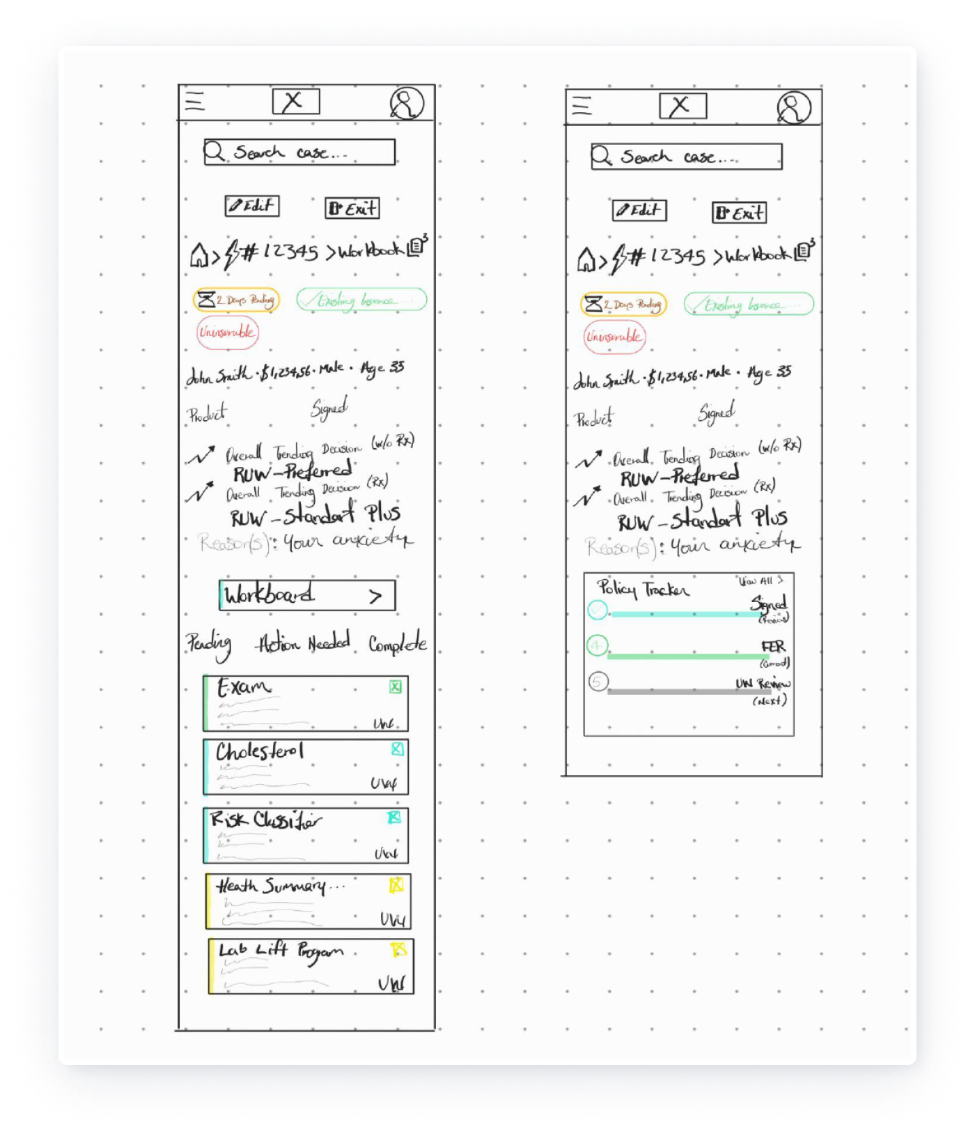
Low-fidelity wireframes are early design sketches used to outline structure, layout, and functionality. These include paper wireframes with screen size variations to ensure responsive design. By visualizing layouts for desktops, tablets, and mobile devices, quick iterations can be made to focus on usability and seamless experiences without being tied to branding.
Low-Fidelity Wireframes
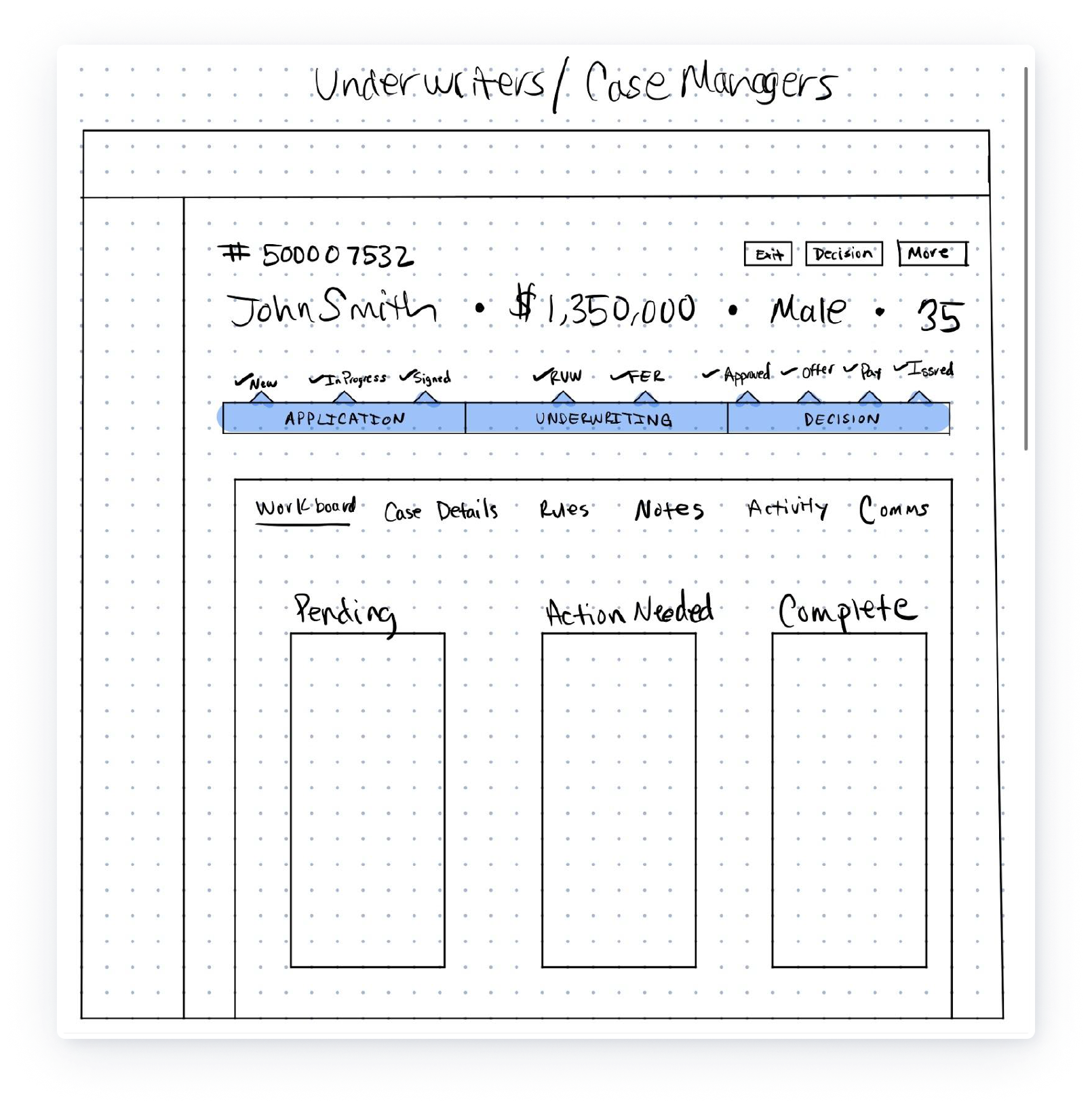

These mid-fidelity wireframes build on the structure of low-fidelity sketches, introducing more detail and refinement. They focus on layout, functionality, and user interaction while still avoiding full visual design. The purpose is to:
Define the placement of interface components and ensure logical grouping of information.
Incorporate feedback from earlier iterations to refine usability.
Visualize key workflows, like tracking case progress or managing tasks, in a format closer to the final design.
These wireframes also begin to address responsive behaviors and highlight specific user interactions, laying the groundwork for high-fidelity prototyping and testing.
Mid-Fidelity Wireframes

Usability Study: Parameters
Unmoderated Study
UserZoom
United States, Remote
5 Participants
Usability Study: Key Findings
-
🧭 Navigation
Users found the navigation intuitive but suggested enhancing the visibility of the search feature for quicker access.
-
📱 Responsive Design
Some participants struggled with accessing specific functions on smaller screens, highlighting the need for better responsiveness across devices.
-
⚙️ Customization
While users appreciated the clear layout, they expressed interest in having more customization options for their dashboards to better suit individual needs.
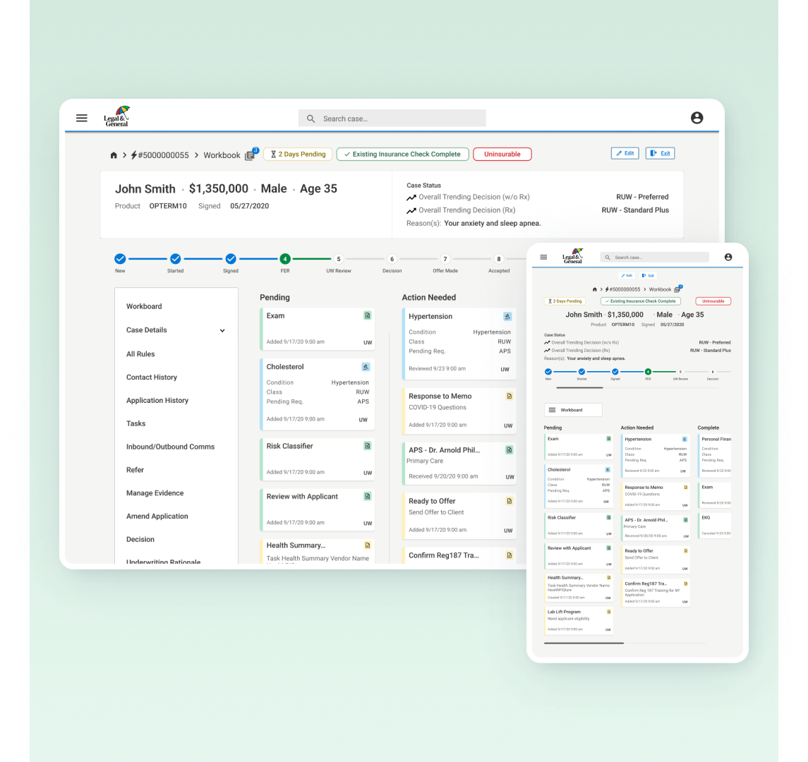
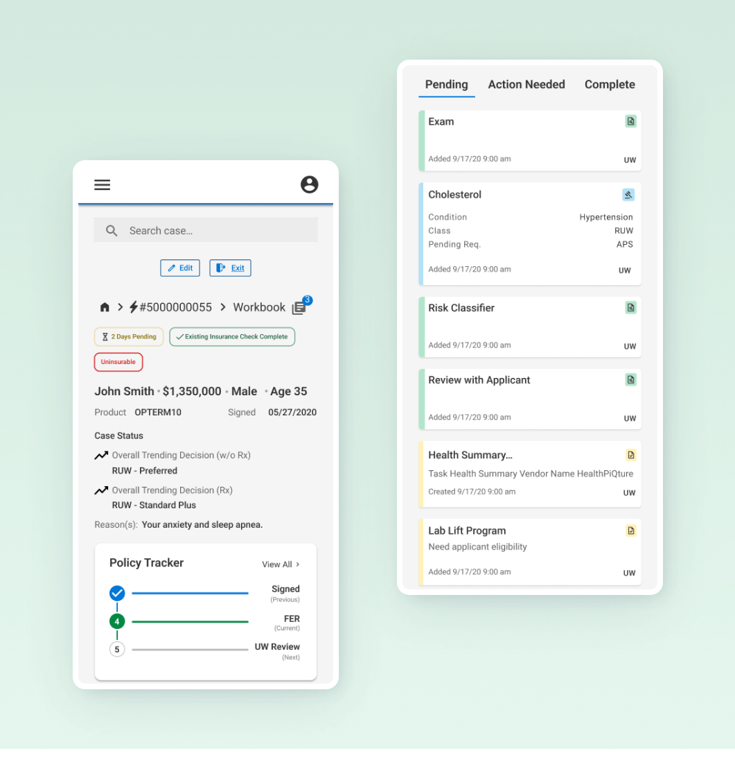
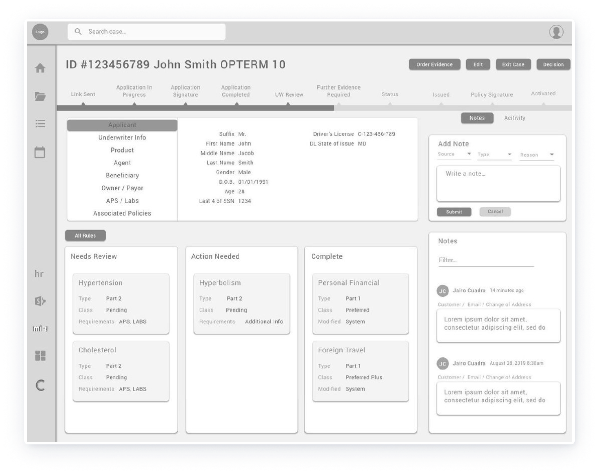
High Fidelity Mockups
-

Before User Testing
The initial design focused on functionality but lacked clarity in workflow visibility and task presentation, relying on assumptions about user behavior.
-

After User Testing
User feedback guided improvements, including clearer progress indicators, enhanced task management, and a more organized, intuitive layout for better usability.

Screen Size Variations
Accessibility Considerations
-
⌨️ Keyboard Navigation
All interactive elements were designed to be fully accessible via keyboard navigation, ensuring that users with motor impairments can effectively navigate and operate the platform without requiring a mouse.
-
🎧 Screen Reader Compatibility
ARIA (Accessible Rich Internet Applications) labels and roles were implemented to ensure seamless compatibility with screen readers. This allows visually impaired users to accurately interpret and interact with the platform’s content and functionality.
-
🎨 Color Contrast
High-contrast color schemes were applied to meet WCAG (Web Content Accessibility Guidelines) standards. This ensures that text and interactive elements are clearly visible and accessible to users with visual impairments, improving overall readability and usability.
Takeaways
The project transformed the underwriting process by streamlining workflows, enhancing collaboration, and improving data accessibility for underwriters, case managers, and agents. These changes reduced processing times, increased accuracy, and elevated user satisfaction, with users noting the platform’s intuitive design and efficiency in managing complex tasks.
Impact
This project deepened my understanding of the importance of user-centered design and how addressing specific pain points can lead to impactful solutions. I honed my skills in user research, information architecture, and iterative design processes, while learning how cross-functional collaboration and stakeholder feedback play a critical role in creating effective and scalable products.
What I Learned
Next Steps
-
🛠️ Feature Expansion
Introduce additional features, such as advanced tracking tools and AI-driven recommendations, to further enhance efficiency and reduce manual efforts for underwriters, case managers, and agents.
-
📊 Data Analytics Integration
Implement real-time dashboards that provide actionable insights, enabling users to monitor performance metrics, track application progress, and identify bottlenecks in the underwriting process.
-
🤝 User Training & Support
Conduct comprehensive training sessions for all user roles to ensure they are fully equipped to utilize the platform's capabilities. Develop an ongoing support system, including help documentation and live chat support, to address user concerns and questions.