Febuary 25, 2026
The Complete UX Design Workflow: From Idea to Launch (Without Skipping a Step)
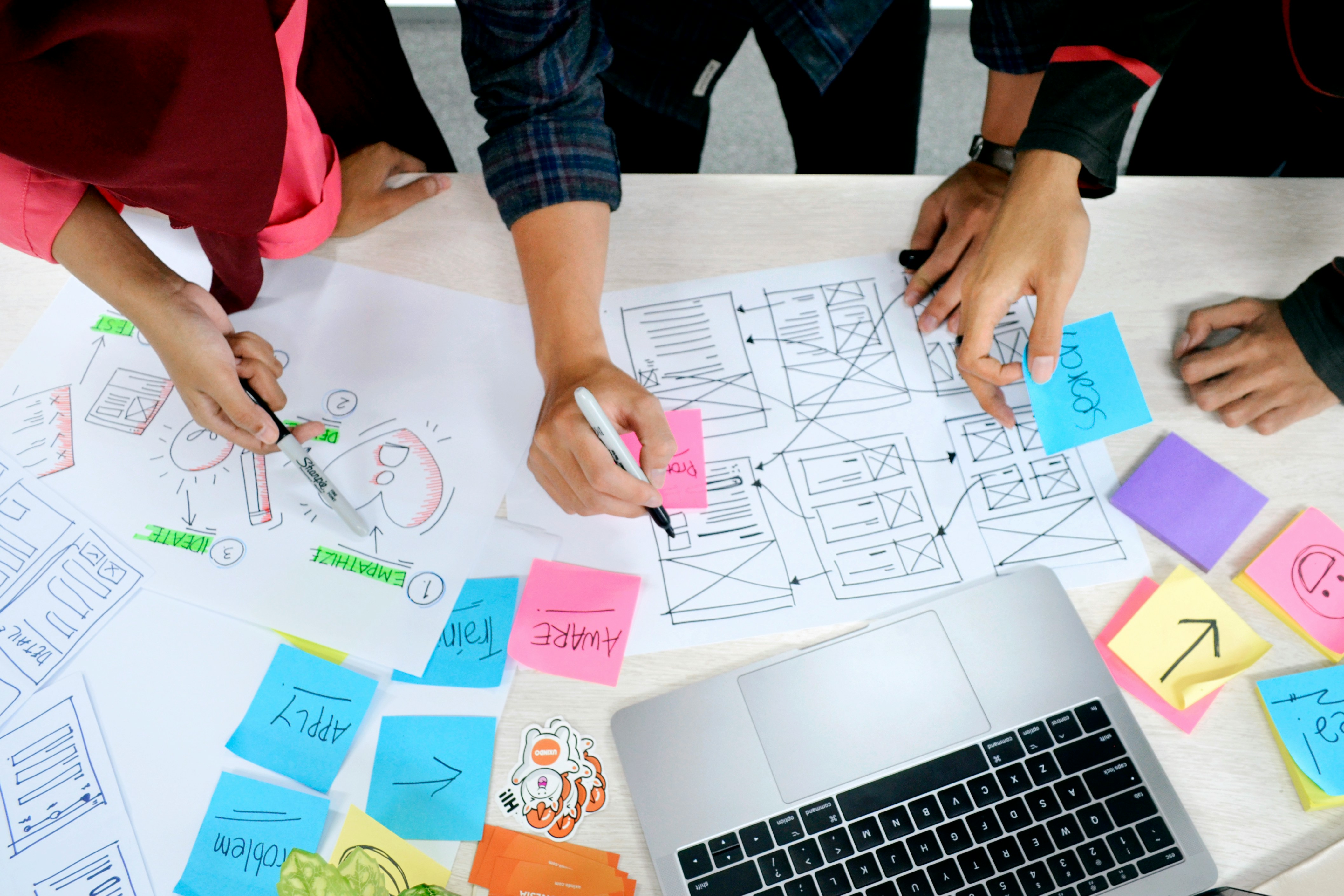
Great UX rarely comes from a flash of inspiration. It comes from a process, a repeatable way of moving from a fuzzy problem to a polished product that real people can actually use. The teams that ship consistently good work are not more talented than everyone else. They are more disciplined about the steps in between.
What follows is the end to end workflow I use on enterprise SaaS and FinTech projects, from the first research conversation to the reflection after launch. You can adapt the ceremony to fit your team, but the sequence matters. Skip a phase and you usually pay for it later, in rework, in misalignment, or in a product that tests well in a mockup and falls apart in someone's hands.
1. Empathize
Before I open a design tool, I want to understand who I am designing for and what actually makes their day harder. That means talking to real users, reading the analytics for how the current product behaves, and studying the competitive landscape honestly rather than defensively. Personas and empathy maps are useful here, but they are a means to an end. The real deliverable of this phase is a clear, shared answer to one question: who are we designing for, and which of their problems genuinely matter?
In regulated, data heavy industries this step is where most of the risk hides. The people using an underwriting tool or a claims dashboard have deep domain knowledge and very little patience for interfaces that ignore how they actually work. Time spent here is never wasted.
2. Define
Research that stays in a document changes nothing. The Define phase turns everything you learned into direction. I write a single, focused problem statement, map the current user journey with its friction points marked, and line the user goals up against the business goals so the tradeoffs are visible from the start.
The output is alignment. When a stakeholder later asks why a screen works the way it does, the answer traces straight back to a problem everyone agreed was worth solving.
3. Ideate
Only once the problem is clear do I let myself explore solutions. The goal early on is quantity and range, not polish. Quick sketching exercises, low fidelity concepts, and a bit of structured brainstorming surface far more options than a single "obvious" answer ever would. Then I narrow, mapping each idea back to the user goals and committing to the two or three directions worth investing in.
Exploring broadly and then choosing deliberately is what keeps a design from quietly defaulting to whatever was easiest to build.
4. Define the Feature
Between a promising concept and a working design there is a translation step that teams love to skip. Before detailed design starts, I write down what the feature actually is: the step in the flow it belongs to, its purpose, the audience it serves, and the notes a developer will need. This becomes the shared source of truth that tickets and dev notes hang off of.
It is unglamorous work, and it is exactly what prevents the "wait, that is not what I thought we were building" conversation three weeks later.
5. Prototype
Now the ideas become something you can point at. I move from low fidelity wireframes to high fidelity mockups, pulling from the design system so the work stays consistent, then link the screens into an interactive prototype. Annotations travel with the screens so reviewers understand intent, not just appearance.
By the end of this phase, stakeholders and users can experience the product instead of imagining it. That shift, from description to demonstration, is where feedback gets specific and useful.
6. Test
A prototype is a question, and usability testing is how you get it answered before code makes the answer expensive. I plan the sessions around real tasks, recruit participants who resemble the actual users, and watch where people hesitate, backtrack, or misread the interface. Then I synthesize what I saw into a short list of insights I can act on.
Testing is not about proving the design is good. It is about finding the places it is not, while fixing them still costs a few hours instead of a sprint.
7. Iterate
No design survives first contact with users unchanged, and that is the point. Iteration turns raw feedback into a stronger solution. I run a focused review, document what is in and out of scope, and produce a clean second version that reflects what testing taught me. Good designs become great in this loop, not in the first draft.
8. Dev Review
A design is only as good as the build it becomes, so the handoff deserves real care. I prepare specs, connect design tokens and components, and annotate the edge cases and interactions that are easy to miss from a static file. A walkthrough with the engineers turns a document dump into a shared understanding, and their feedback often improves the design before a line of code is written.
When developers have everything they need up front, implementation stays aligned with intent and the back and forth drops dramatically.
9. QA
Once the feature is built, it has to be checked against what was designed. I work from a QA checklist, validating interactions, responsive behavior, and consistency across browsers and devices, then retesting anything that had to be fixed. This is the phase that keeps the shipped experience honest to the intended one.
10. Accessibility Review
Accessibility is not a finishing touch, it is part of what makes a product usable at all. I check color contrast, alt text, and ARIA labels, confirm that forms and controls are labeled properly, verify focus states, and combine an automated scan with a manual keyboard pass. Nothing replaces actually navigating the product without a mouse.
The payoff reaches everyone. Clearer contrast, sensible focus order, and well labeled controls make the experience better for every user, not only those relying on assistive technology.
11. Close the Loop
The work is not finished when it ships. I archive the project files, write a short summary of what we set out to do and what actually happened, and turn the strongest projects into case studies. A little reflection here compounds. It makes the next project faster and gives the team a record of why decisions were made.
Final Thoughts
A strong UX process does three quiet things well. It reduces risk by catching problems early, it keeps teams aligned around a shared understanding, and it improves outcomes for both users and the business. None of that requires heroics. It requires following the sequence consistently.
If you want to mature your practice, do not start by chasing a flashier deliverable. Start by making this workflow repeatable. Consistency, more than talent, is what turns good designers into product leaders people trust.
Written by Jay Cuadra